


Introduction
Design is not just about aesthetics; it’s about how well something works for its intended purpose. In the Indian context, usability plays a critical role in making everyday products and services accessible and efficient for a diverse population. In this blog, we will explore five examples of good design and five instances of bad design, all analyzed from the perspective of usability.
Good Designs
Apple Devices:
Apple products are known for their sleek and user-friendly design. They excel in providing a seamless and intuitive user experience. The minimalistic design, well-organized interface, and consistent user interactions make them accessible to a wide range of users. Even in the Indian context, where language and literacy diversity can be a challenge, Apple’s design remains user-centric.
Google Maps:
Google Maps is a go-to navigation app for millions of Indians. Its user-friendly interface, detailed maps, real-time traffic updates, and voice-guided directions have transformed the way people navigate in India. The inclusion of local languages, landmarks, and even public transportation information makes it particularly useful in an Indian context.
PhonePe:
PhonePe, a popular Indian digital payment platform, has gained users’ trust due to its usability. It offers a simple and intuitive interface for transferring money, paying bills, and more. Additionally, it supports multiple Indian languages and offers a range of payment options, catering to a diverse user base.
QR Code Speakers for Payment:
The adoption of QR codes for payment in India has revolutionized digital transactions. These codes are simple, secure, and convenient for both customers and businesses. The design’s brilliance lies in its ability to integrate seamlessly with various payment apps, making it user-friendly for people of different backgrounds and tech-savviness.
Monobloc Plastic Chair:
The ubiquitous monobloc plastic chair is a testament to simple and effective design. Lightweight, durable, and stackable, it meets the seating needs of various Indian settings, from homes to street vendors. Its ergonomic design, low cost, and ease of maintenance make it a practical and user-friendly choice.
Usability in Indian Design: 5 Good and 5 Bad Examples
Read also on Medium
Bad Designs
IRCTC Railway Ticket Website:
The Indian Railway Catering and Tourism Corporation (IRCTC) website is infamous for its poor usability. Users often encounter issues with slow loading times, complex forms, and frequent errors during booking. The lack of a mobile-responsive design adds to the frustration, making it challenging for many Indians to book train tickets online.
Municipal Websites:
Municipal websites across India vary widely in terms of usability. Many are cluttered with information, lack a user-friendly interface, and often require users to navigate through layers of bureaucracy to access services or information. This makes it difficult for citizens to engage with their local government online.
Inconsistent Road Signages in India:
Inconsistent road signages across Indian cities and highways can be a nightmare for drivers. Different regions follow different conventions for signages, leading to confusion and potential hazards. A standardized, intuitive signage system would greatly improve road safety and usability.
ATM User Interface:
ATMs in India often have poorly designed user interfaces. Confusing menus, non-standardized layouts, and cryptic error messages can create usability challenges. This is especially problematic for people in rural areas who may not be familiar with technology.
Sensor Taps:
Many public restrooms in India now feature sensor taps, but their usability can be questionable. They often have sensitivity issues, leading to inadequate water flow or excess wastage. Inconsistent sensor performance frustrates users and undermines water conservation efforts.
Discussion
In the Indian context, usability is of utmost importance due to the country’s diversity in terms of languages, literacy levels, and technological familiarity. Let’s delve deeper into these examples of good and bad designs and analyze why they succeed or fail in terms of usability.
Good Designs — A Closer Look
Apple Devices:
Apple’s design success lies in its commitment to simplicity. The minimalistic approach reduces cognitive load for users. The consistent design language and iconography make it accessible, regardless of the user’s language or familiarity with technology. This design is particularly advantageous in India, where numerous languages and dialects are spoken.
Google Maps:
Google Maps is a prime example of a global product adapted for the Indian context. It offers accurate directions in local languages, includes landmarks and local businesses, and provides real-time traffic information. This not only aids urban users but also helps those in rural areas who may not be well-versed in English.
PhonePe:
PhonePe’s success is rooted in its user-centric approach. The interface is designed for simplicity and efficiency, making digital payments accessible to a wide range of users. It offers a choice of Indian languages, facilitating usability for non-English speakers.
QR Code Speakers for Payment:
The adoption of QR codes for payments has been a game-changer in India’s digital payment ecosystem. It simplifies transactions and reduces the need for cash, which is especially beneficial in a country with a large unbanked population.
Monobloc Plastic Chair:
The monobloc plastic chair’s design is an excellent example of addressing a fundamental need with efficiency. Its lightweight, stackable design caters to diverse seating requirements in India, from homes to public spaces. It’s affordable and easy to clean, making it a practical choice for various settings.
Bad Designs — A Closer Look
IRCTC Railway Ticket Website:
IRCTC’s website is a prime example of how not to design a user interface. The slow and clunky website often fails to provide users with a seamless booking experience. This is a significant usability concern, especially in a country where train travel is a lifeline for millions.
Municipal Websites:
Municipal websites, which should provide citizens with vital information and services, often fall short in terms of usability. Complex navigation, outdated designs, and a lack of user-centric features hinder citizens’ ability to interact with their local governments online.
Inconsistent Road Signages in India:
Inconsistent road signage creates confusion and safety hazards. Travelers need to adapt to different sign conventions when moving between regions, and this can be a daunting task. Standardized and intuitive road signage is crucial for road safety and usability.
ATM User Interface:
ATMs are designed to provide a quick and convenient way to access cash, but poor user interfaces can turn a simple task into a frustrating experience. This is a significant issue in India, where many people are still getting accustomed to digital banking.
Sensor Taps
While sensor taps aim to promote hygiene and water conservation, their usability can be compromised due to inconsistent performance. Users often find themselves waving their hands repeatedly to activate the sensor, leading to frustration and potential water wastage.
The Impact of Usability on Inclusivity
In India, where languages, literacy levels, and technology adoption vary greatly, usability takes on a heightened importance. Usable designs are not just convenient; they are inclusive, ensuring that a diverse population can access and benefit from products and services. Let’s examine this impact more closely:
Language Inclusivity:
Good designs, such as Google Maps and PhonePe, take language diversity into account. They offer interfaces in multiple languages, making it easier for users across India to engage with these services. This inclusivity is especially crucial in a country where hundreds of languages are spoken.
Simplicity and Literacy:
Usable designs, like Apple devices and the monobloc plastic chair, rely on simplicity and minimalism. This design philosophy accommodates users with varying levels of literacy and tech-savviness, ensuring that products are accessible to a broader audience.
Accessibility in Rural Areas:
Consider the impact of usable designs in rural India. Google Maps helps villagers navigate to healthcare facilities or marketplaces, while PhonePe simplifies digital payments for users who may be new to smartphones and online transactions. These designs bridge the urban-rural divide by making technology more accessible.
Efficiency for All:
QR code-based payments, while technologically advanced, are designed to be efficient and user-friendly. This benefits everyone, from tech-savvy urban dwellers to those in remote areas who may not have access to traditional banking.
Enhancing Daily Life:
The monobloc plastic chair, through its practical design, improves the quality of life for millions of Indians. Whether it’s providing seating at home, in public spaces, or at street food stalls, this design ensures comfort and convenience.
The Necessity of Human-Centered Design
The examples of good design discussed here share a common thread — they are human-centered. This approach to design takes into consideration the needs, preferences, and limitations of the end-users, making the product or service not just functional but also enjoyable to use.
In contrast, the bad design examples suffer from a lack of user-centric thinking. They reflect a disconnect between the designers and the actual users, resulting in products or services that are cumbersome and frustrating.
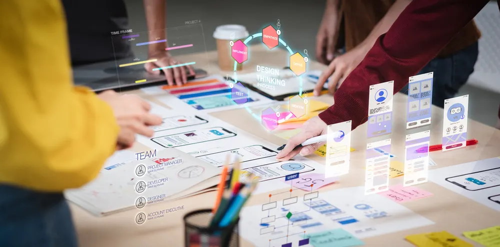
Design Thinking in India
Addressing the challenges of usability in India requires a commitment to design thinking. This approach involves understanding the unique needs and constraints of users and iterating on designs based on real-world feedback. Here are a few considerations for implementing design thinking in India:
User Research:
Conduct extensive user research to understand the needs, preferences, and challenges of the target audience. This research should include diverse segments of the Indian population to ensure inclusivity.
Prototyping and Testing:
Develop prototypes and conduct usability testing with real users. This iterative process allows designers to refine their products or services based on actual user feedback.
Language Localization:
Prioritize language localization to make products and services accessible to a wider audience. This is particularly critical in a multilingual country like India.
Training and Education:
Invest in user education and training programs to help users adapt to new technologies or services. This is especially important when introducing innovative solutions to rural or less tech-savvy populations.
Accessibility Standards:
Follow international accessibility standards to ensure that products and services are usable by people with disabilities.
Conclusion
Usability is a critical aspect of design, particularly in the diverse and complex context of India. Good design is not just about aesthetics but about creating products and services that are accessible, efficient, and inclusive. The examples of good and bad designs presented here underscore the importance of considering the needs and preferences of users in the design process.
Design thinking, with its emphasis on empathy and user-centricity, is a powerful approach to address usability challenges in India. By conducting user research, prototyping, and testing, localizing products and services, and promoting user education, designers and businesses can create solutions that work for all Indians, regardless of their language, literacy, or technological familiarity.
In a country as diverse as India, good design is not just a luxury; it’s a necessity. It has the power to transform the way people interact with technology, navigate their environment, and access essential services. Ultimately, a commitment to usability and design thinking can lead to a more inclusive and accessible future for all Indians.